UCAS Stand
- Kimberly Roberts
- Oct 8, 2021
- 2 min read
Updated: Apr 18, 2022
Before classes began, I received an email from Andrew asking whether I would be willing to illustrate a world map for the university's UCAS stand for an event they were going to the following week. As I still had a lot of free time and itching to be creating again, I said yes. However, it had to be done in a quick turnaround (less than a week).
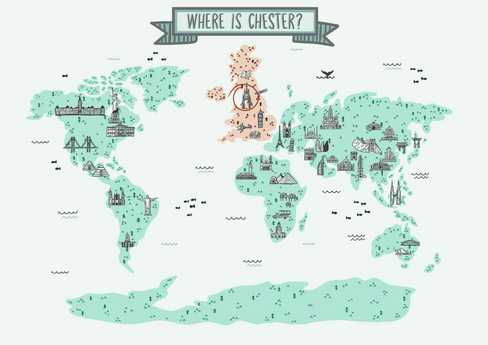
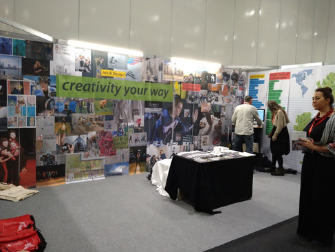
The purpose of the brief was to show where Chester was on the world map, mainly to inform potential students where it is as they often don't know where Chester is. I also took time in illustrating other world monuments to fill the map more but made Chester's monument (the Eastgate clock) bigger to stand out more.
At first, I illustrated a magnifying glass to emphasise Britain more. However, Andrew said that wasn't needed, and I should try to make Britain as big as possible. Then I added a red circle around the clock to emphasise where Chester was, but it wasn't needed like the magnifying glass, so it was removed in the final illustration. I was worried about Britain still appearing too small in the composition I created. Therefore, I thought having this red accent could help direct the student's attention to where Chester is.

Another thing I included in the original design was a banner that said, "where is Chester?" to accompany the red circle to tie together the meaning behind the piece. I thought I would include this within the design to balance the composition and fill the space more. I struggled a lot on how big to make Britain as I didn't know whether they still wanted to make the world map accurate or not. Still, in the end, Andrew asked for the photoshop file, where he altered the size of the map and took out the banner and circle as they were unnecessary for the final piece.
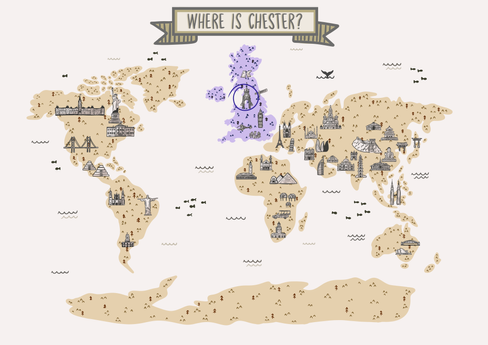
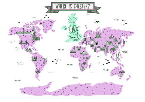
I created colour variations of the map to have more variety in the illustration, too, so then they could pick their most favoured colour scheme. To emphasise Britain more, I made it a different colour, so it just draws the student's attention to Britain.
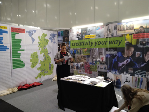
However, when looking at the final image, what the final illustration looked like, I noticed they went for a different colour scheme (a harsher green for the UK and a bluer colour for the rest of the continents). I understood why they changed the colour scheme to tie it in with the other billboard that says "creativity your way" to have more consistency, and it also stands out more with the darker colours.
Overall, this was such an exciting start to 3rd year. Despite it only being a small task, it got me inspired and ready to start this year and create work again. I look forward to future projects throughout this year and hopefully work on more live briefs to build up more experience before leaving education.









Comments