Component One - Creative Design Practice
- Kimberly Roberts
- Nov 5, 2021
- 4 min read
I wasn’t quite sure what to blog about next, but I thought I would start talking about my university work at the moment. I am currently waiting on feedback on my component one work from one of my modules, “Creative Design Practice”. Unfortunately, I had to ask for a 7-day extension as I felt very overwhelmed with the workload, and I was still severely grieving over my cat of 15 years, who died from stomach cancer. However, I still managed to power through the component, and I felt like some of the work I created for the module tested my abilities in both illustration and software use.
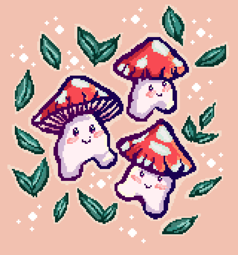
I thought I would begin talking about my personal favourite project, the “2.5” project. My assignment was to create concept art, UI examples of the game and promotional material for a video game concept I created called “Funguy”. I bought a program called Aseprite which was a lucky find on steam (a game launcher) that works like Photoshop in a way but converts the illustrations automatically transforms it into pixel artwork. I was super impressed with the program as, until now, I’ve been doing it the hard way by using the marquee tool on Photoshop, so £15 for this program was totally worth it. Not to mention it’s an art style that I haven’t really explored in a while since my first year, which is a shame as I used to love creating pixel artwork, and I sincerely appreciate the craftsmanship that goes into each pixel. Overall, I loved using this program, and I will make sure to use it again in the future.
Another project that I loved working on was the instrumental project. Even though it was simple, it was nice to not think of something overcomplicated. I decided to visualise a song my boyfriend created a few years ago as he never actually named or designed the song's cover. I decided to go with a mountain in the clouds type illustration because I took the synaesthesia approach to this project. Alex’s (boyfriend) music made me feel like I was on an adventure in the clouds, so it only felt like an illustration for the song's cover. The only thing I struggled with was the title name for it, as I didn’t want to copy any existing songs. In the end, I decided to go with “Euphoria” because every time I listen to his music, it makes me feel happy and excited as if I’m going on an adventure.
Next was the project with the prompt word “public convenience” when I first started that brief, I was severely confused because I was struggling with how I would make this relate to game design or anything similar. But then I was attempting to play “Genshin Impact” on my phone and severely had a hard time playing due to it being really uncomfortable. This led me to my idea of creating a controller for mobile phones. Mobile games have been improving significantly and becoming more and more like regular video games on consoles/pc. Once I had this idea, I felt like the project became more manageable because I realised it didn’t have to relate to a toilet. I decided to create the packaging for it and one poster design, I would have liked to have made one more, but I was running out of time for the projects to be handed in. For this project, I wanted to try a different style than I usually do and avoid illustration as I wanted to experiment more with pattern design. I went for a vapourware type aesthetic because it suited the feel of the project to make it seem more futuristic, which turned out in my favour in the end. This project was another one that I was pleased with as it went from being the hardest to come up with a concept for to an effective poster and packaging design for something I should really invest in.
The last project was the prompt word “Frankenstein”, another challenging prompt to create a project out of. For this project, I decided to develop a poster and merchandise design for the upcoming DLC for an existing video game called “Dead by Daylight”. I would have liked to work on some 3D modelling for this project; however, I don’t feel confident in putting all of my eggs within one basket with this project as there is still a lot I need to do to use 3D software effectively. This being said, I decided to create one of the most detailed illustrations I have ever done for a poster design. I wanted to make it highly clear because I wanted to mimic the official poster design to have a sense of continuity. I didn’t have time to colour the illustration with RGB, so I used a monochromatic colour pattern which I personally prefer as it really brings out some of the details within the drawing. I also created an additional merchandise design of the character within one of the video game’s symbols to make it relate back to the video game. Out of all the projects, I felt like this one was the least developed because I felt like I rushed this one the most compared to the other projects, and I struggled with what to replace the 3D modelling with as I didn’t have enough time to create something like that.
Overall this component was a huge learning curve as it felt like a massive kick up the backside for me to get back into the groove of designing and illustrating again after taking a break over the summer holiday. From each project, there is something that I am personally proud of, and I would like to include them all within my future portfolio.


Comments